Scroll to explore
introduction
introduction


This is the culmination of my experience in the Graphic Design program at ASU. Throughout my senior year, I’ve been pushed to think more about the intention behind my design and what I want to contribute to the world with it. Paul Rand’s quote “design is relationships” is something I adopted into my philosophy this year after using it as the basis for my poster submission in the fall semester. It speaks to the role that design plays in fostering connections between its creator and its viewers, but more broadly to the power that we as designers have to actually do something and help our communities. I want to be able to look back on life and be proud, not just because my designs were good or the money I made, but because I did things that actually benefitted people.
That is what this project has really been about for me. Technology is moving faster than it ever has before, and for most people it’s really difficult to keep up with what’s going on between day to day life. Thus, important things like the expansion of AI-powered surveillance systems and private companies selling your data to the government tend to fly under the radar.
poster show poster


To fund our senior exhibition, every year the senior class puts on a poster show where we reach out to studios for donations and auction them off. We were all tasked with creating a poster and identity for the show, and took a vote for the winning one. I centered my poster on one of Paul Rand's quotes, "design is relationships". As I mentioned in my introduction, this quote is about the relationship between designer and viewer, and that is very befitting of a poster show in which the viewer feels a connection with a poster and wants to buy it.
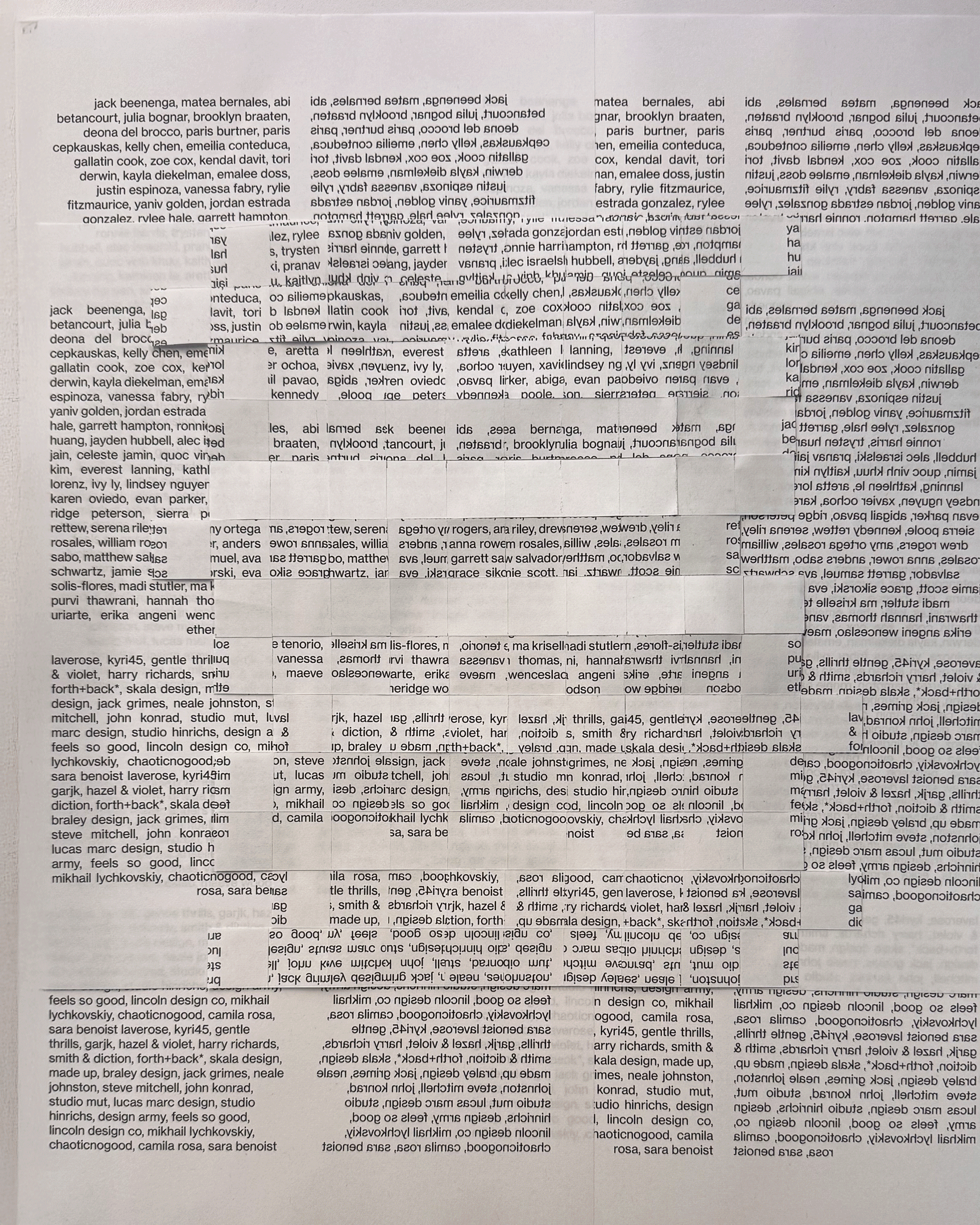
I wanted to experiment with cut paper, and the new relationships I could make by cutting and rearranging the typography. The process was really fun, as I really enjoyed going analog to create something truly unique. This project restarted my love for doing things physically, as that wasn't something I had done very much of in my junior year.
To fund our senior exhibition, every year the senior class puts on a poster show where we reach out to studios for donations and auction them off. We were all tasked with creating a poster and identity for the show, and took a vote for the winning one. I centered my poster on one of Paul Rand's quotes, "design is relationships". As I mentioned in my introduction, this quote is about the relationship between designer and viewer, and that is very befitting of a poster show in which the viewer feels a connection with a poster and wants to buy it.
I wanted to experiment with cut paper, and the new relationships I could make by cutting and rearranging the typography. The process was really fun, as I really enjoyed going analog to create something truly unique. This project restarted my love for doing things physically, as that wasn't something I had done very much of in my junior year.
the process
the process
drag to scroll, click to enlarge.
drag to scroll, click to enlarge.
The different layers that make this poster up.

Cut paper experiment.

The cut title overlayed on a printed version.

Early digital sketch.

Alternate color scheme.
jfkdjflsdkfjdsfjk
The different layers that make this poster up.
Cut paper experiment.
The cut title overlayed on a printed version.
Early digital sketch.
Alternate color scheme.
social issue clock


The clock was an interesting project for sure. Creating a physical clock from scratch was an experience I'll remember for a while, as even though there were plenty of difficulties along the way, it ended up being a fun project.
The problems I faced were good for me in the long run, as it showed me the amount of planning that's needed to make something physically, which was really beneficial to my experience making my exhibit later on in my senior year.
2D clock process
2D clock process

First design I made based on a panopticon prison.

Playing with abstracting the eye into the minute and hour hands.

An interesting experiment.

Mimicking an old camera effect with an abstracted face.

Started playing around with an ASCII effect.

Combined the camera idea with the ASCII effect.

Refining.

Final 2D clock.
First design I made based on a panopticon prison.
Playing with abstracting the eye into the minute and hour hands.
An interesting experiment.
Mimicking an old camera effect with an abstracted face.
Started playing around with an ASCII effect.
Combined the camera idea with the ASCII effect.
Refining.
Final 2D clock.
3d clock process
3d clock process

Initial sketches for how I wanted to make my clock.

First prototype printing on an acrylic disk with a Canon Arizona flatbed printer.

The frame for my lights to sit in gave me the most trouble. I ended up using 4 wreath rings glued together.

Drilling a hole in my acrylic. Very scary but successful.

Used L-brackets and glued bolts to hold the back panel in place.

Close-up of the lights inside.

Close-up of the text with the light shining though.

As the minute hand turns, the hour hand is reavealed through circular cutouts, mimicking a blinking red light.
Initial sketches for how I wanted to make my clock.
First prototype printing on an acrylic disk with a Canon Arizona flatbed printer.
The frame for my lights to sit in gave me the most trouble. I ended up using 4 wreath rings glued together.
Drilling a hole in my acrylic. Very scary but successful.
Used L-brackets and glued bolts to hold the back panel in place.
Close-up of the lights inside.
Close-up of the text with the light shining though.
As the minute hand turns, the hour hand is reavealed through circular cutouts, mimicking a blinking red light.


the poster show

Putting on the poster show was undoubtedly the most stressful time of my senior year. There were so many moving parts, and every one of us had to give 100% for everything to go off without a hitch. To manage this, we split up into different committees. I was on the web team, and we were in charge of setting up the website and the backend for the auctions, as well as be in the back during the show actively fixing any bugs that came our way. I'm not great at WordPress, so I was mostly in charge of making animations and working on the clock page with another teammate.
This was a great experience to look back on, and it taught me a lot about what goes into putting on a big event. This definitely helped a lot in terms of our final exhibition, and made things go a lot smoother.
the website
the website

Home page.

Location graphic I made for the home page.

Landing for the clock page I worked on.

Clock page layout.
The home page.
Themed map I made for the website.
Hero image for the clock page I worked on.
Clock page layout.
Home page.
Location graphic I made for the home page.
Landing for the clock page I worked on.
Clock page layout.


exhibition poster

Similar to the poster for the poster show, our entire class had to come up with a concept for our social issue exhibition. The process of creating this poster was a long one, as the original idea I had didn't end up working the way I wanted it to. The concept used CMYK misregistration—when printing plates fall out of alignment and expose the individual colors underneath—as a metaphor for calling attention to the systems people stop noticing. The metaphor was there, but for the average person that doesn't know what CMYK is, explaining it would be too much.
Not long before the submission, I decided to pivot to something different. I printed the word obscurity on two pages, and cut a couple letters out of one of the pages. I then overlayed it onto the the second page and shifted it to hide the letterforms behind it. The idea here was similar to my previous idea, just simplified in the letterforms themselves being hidden. This project was a great lesson into how the first idea isn't always the best.
The process of creating this poster was a long one, as the original idea I had didn't end up working the way I wanted it to. The concept used CMYK misregistration—when printing plates fall out of alignment and expose the individual colors underneath—as a metaphor for calling attention to the systems people stop noticing. The metaphor was there, but for the average person that doesn't know what CMYK is, explaining it would be too much for a simple exhibition poster.
Not long before the submission, I decided to pivot to something different. I printed the word obscurity on two pages, and cut a couple letters out of one of the pages. I then overlayed it onto the the second page and shifted it to hide the letterforms behind it. The idea here was similar to my previous idea, just simplified in the letterforms themselves being hidden. This project was a great lesson into how the first idea isn't always the best.
the process
the process

First attempt at CMYK poster.

Second attempt. Interesting but very busy.

Last attempt. Works but I still wasn't satisfied.

Different shift variation.

Final shift.

First attempt at laying new type out on poster size.

Second attempt, split the text over 3 lines instead of 2.

Playing with colors before settling on black and white.
First attempt at CMYK poster.
Second attempt. Interesting but very busy.
Last attempt. Works but I still wasn't satisfied.
Different shift variation.
Final shift.
First attempt at laying new type out on poster size.
Second attempt, split the text over 3 lines instead of 2.
Playing with colors before settling on black and white.
exhibition website
To prepare for the exhibition we split back into our committees from the previous semester. My duties were largely the same, I made some animations to go around the website, and populate the student page. This website was much simpler than the poster show, as we didn't have an auction to run, so we tried to help out in other committees as much as possible.
To prepare for the exhibition we split back into our committees from the previous semester. My duties were largely the same, I made some animations to go around the website, and populate the student page. This website was much simpler than the poster show, as we didn't have an auction to run, so we tried to help out in other committees as much as possible.
the website
the website

The home page.

Another simple animation I created.

Class page I worked on.


Individul student pages.
The home page.
Another simple animation I created.
Class page I worked on.
Individul student pages.
my exhibition

This project ended up being a lot bigger than I initially expected. What started as research into the chilling effect kept expanding the more I dug into it, and eventually I realized I was sitting on something that most people genuinely don't know about and probably should. That realization is what pushed me to open the scope up and take it more seriously as a project.
Working on this project also made me realize how much I enjoy doing things like this. Like I said in my introduction, we as designers hold a lot of power to inform an audience in a way that they actually want to digest the information they're reading because its pleasing to look at. It makes me feel good to know that because of the work I did for this, more people are informed about a topic that we should all be worried about.
From a design standpoint it also pushed me in a direction I wasn't expecting. I do a lot of digital work, so there was something that felt really intentional about making this physical. A screen can't do what an exhibit does—it puts something in front of you that you have to actually engage with, and for a topic about systems most people scroll right past, that felt like the right call.
planning digitally
planning digitally

First attempt at a layout. Scale was a huge issue when I first started.

Made things much smaller. Still doing research so I wasn't firm on what I wanted my exhibit to say.

Finally finished my research and created the data web.

Refined from my previous layout.

The final plan. Removed the timeline to make more space for information.
First attempt at a layout. Scale was a huge issue when I first started.
Made things much smaller. Still doing research so I wasn't firm on what I wanted my exhibit to say.
Finally finished my research and created the data web.
Refined from my previous layout.
The final plan. Removed the timeline to make more space for information.
prep work
prep work

Laser cutting the circles for all my nodes.

Laser cutting my text panels.

Acrylic type ready to be inset.

Close up of inset text.

Close up up data nodes put together.

All pieces ready to be put up at the exhibit.

Measuring everything out.

Putting up the data web.


Laser cutting the circles for all my nodes.
Laser cutting my text panels.
Acrylic type ready to be inset.
Close up of inset text.
Close up up data nodes put together.
All pieces ready to be put up at the exhibit.
Measuring everything out.
Putting up the data web.
final exhibit
final exhibit


conclusion

Overall, senior year was the most memorable year of this program. We did so much, and I felt like I got so much closer to everyone in my class this year. It's rare that you get to be surrounded by so many good designers, and that's something I'll forever miss as I step out into the real world. I want to thank all the professors I've had who have shaped me into the designer I am today. The wisdom they've provided me is invaluable, and I will carry it with me throughout the entirety of my career.
Thank you for taking the time to walk through my senior experience. Visit my portfolio below if you want to learn more about me.
Overall, senior year was the most memorable year of this program. We did so much, and I felt like I got so much closer to everyone in my class this year. It's rare that you get to be surrounded by so many good designers, and that's something I'll forever miss as I step out into the real world. I want to thank all the professors I've had who have shaped me into the designer I am today. The wisdom they've provided me is invaluable, and I will carry it with me throughout the entirety of my career.
Thank you for taking the time to walk through my senior experience. Visit my portfolio at if you want to learn more about me.


social issue presentation
Before we began delving into our social issues and making the clock, we had to create a presentation on what our topic was and some of the research being done on it. I chose to make a YouTube style video for mine, as I felt it really fit the theme of my topic as something you would see and maybe pass as a conspiracy video. Making that video was a fun challenge, and I think the result hit all the emotional points I wanted it to.
This was what really laid the groundwork for my topic, and started me down a rabbit hole much bigger than I was expecting. When I did my initial research for this video, I was hesitant to open things up so I focused my research on the chilling effect as well as it's effect on journalists. After starting my research back up earlier this year though, I went deeper and realized that the evidence for it was there the whole time.